What the map supports
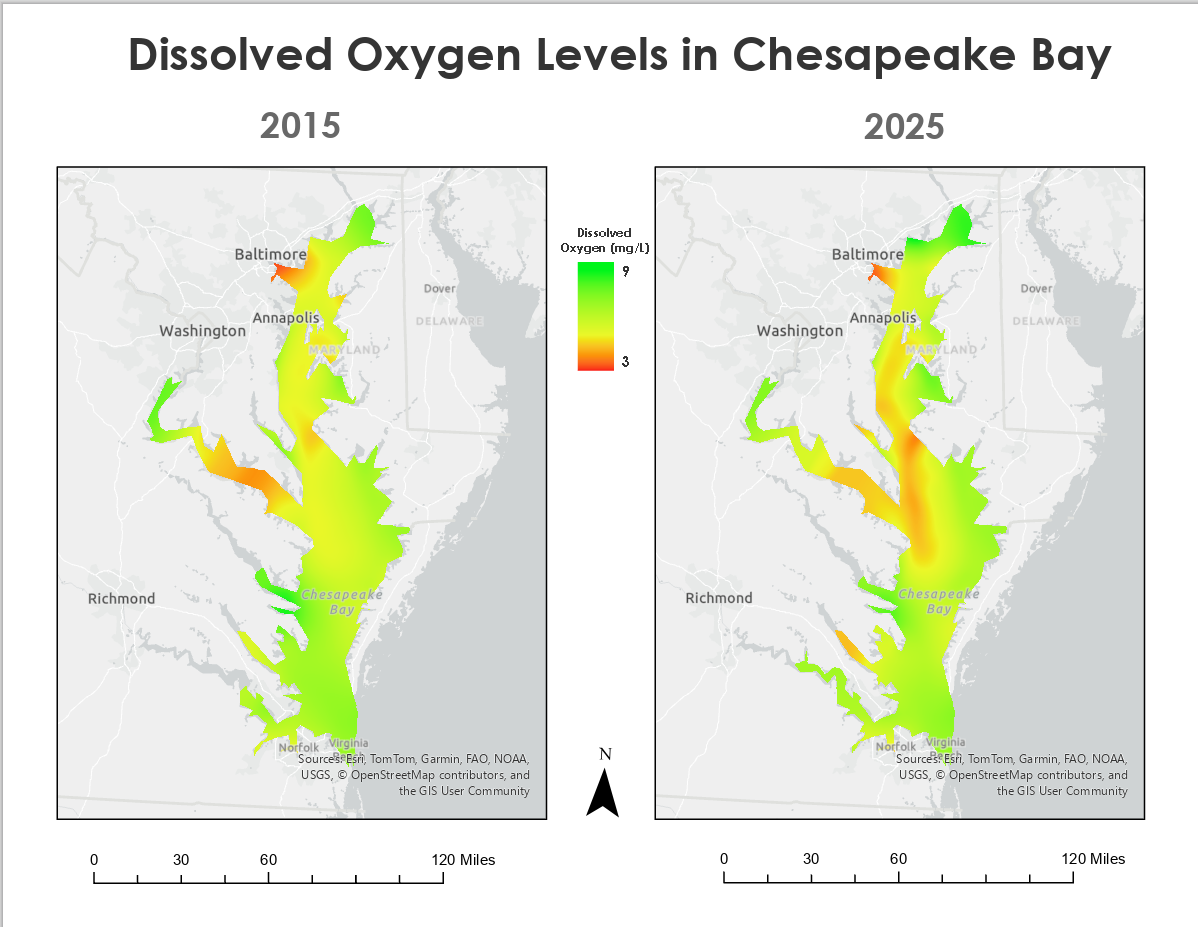
Visual comparison of broad spatial patterns in the supplied 2015 and 2025 dissolved-oxygen observations.
ENVIRONMENTAL GIS · WATER QUALITY · SPATIAL INTERPOLATION
I used supplied monitoring observations to build dissolved-oxygen surfaces for 2015 and 2025 and display them on the same scale.
01 / SPATIAL COMPARISON
Lower dissolved-oxygen estimates appear in warm colors and higher estimates in green across a shared 3–9 mg/L display range.
02 / ANALYTICAL WORK
The observations were supplied to me; my work began with preparing them for analysis and continued through interpolation, comparison, and map design.
Organize the provided dissolved-oxygen observations for consistent spatial processing and year-to-year comparison.
Transform discrete observations into estimated dissolved-oxygen surfaces covering the sampled portions of Chesapeake Bay.
Use a common geographic extent, measurement unit, and color scale so differences between 2015 and 2025 can be read consistently.
Combine the analytical surfaces with reference geography, labels, legend, scale, orientation, and source information.
03 / INTERPRETATION
Spatial interpolation estimates conditions between monitoring locations. It does not turn every mapped pixel into a direct field measurement.
Visual comparison of broad spatial patterns in the supplied 2015 and 2025 dissolved-oxygen observations.
Sampling location, water depth, season, temperature, salinity, and station density can influence dissolved-oxygen patterns and the interpolated result.
Two mapped periods alone do not demonstrate a causal environmental trend or conditions at every location in the Bay.
04 / TEACHING APPLICATION
I would use this comparison to show how point observations become a continuous surface, how station spacing affects the result, and why an interpolated pixel is an estimate rather than a direct measurement.
Return to selected work